- Effective wayfinding depends on clarity, consistency, and spatial logic rather than excessive signage.
- Many Philippine developments struggle with disconnected circulation systems and poorly coordinated sign placement.
- Good signage should support architecture, operations, accessibility, and long-term usability.
Wayfinding becomes noticeable when it fails. Visitors who repeatedly stop to ask for directions, vehicles that slow down at decision points, and crowded circulation areas often indicate that a building or development is not communicating clearly through space, signage, or movement.
In the Philippines, wayfinding problems appear across many project types. Mixed use developments, transport terminals, hospitals, townships, commercial centers, and even residential communities frequently rely on reactive signage added long after the architecture has been completed. The result is often visual clutter instead of clarity.
Good wayfinding is not simply about adding more signs. It depends on how architecture, circulation, visibility, hierarchy, and user behavior work together from the beginning of the planning process.
Why Wayfinding Often Fails
Many developments treat signage as a graphic layer instead of an architectural system. Directional signs are added only after circulation problems already exist, forcing signage to compensate for unclear layouts rather than reinforcing clear movement.
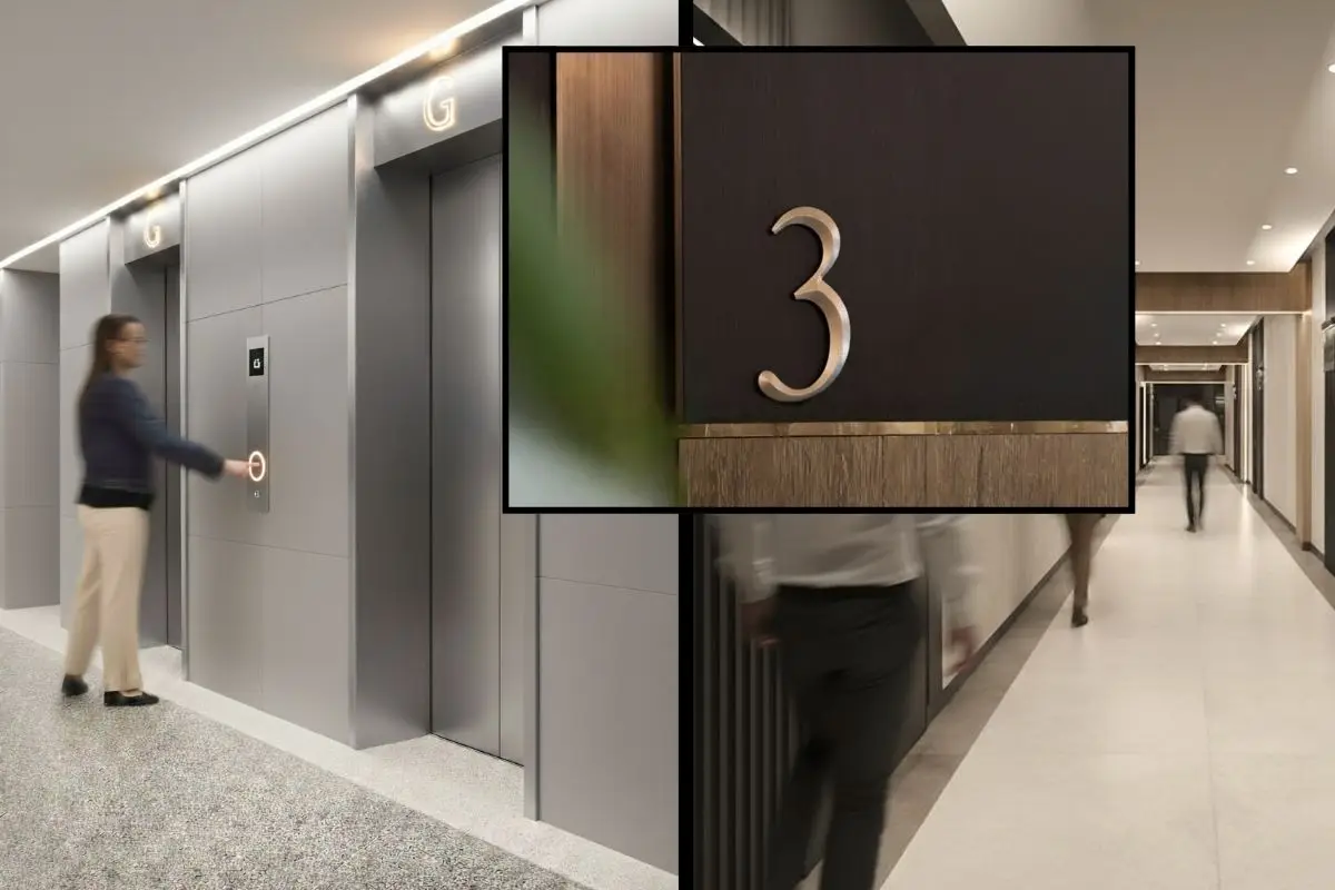
This becomes especially visible in projects where entrances lack hierarchy, parking connections feel disconnected, elevator lobbies appear identical across floors, or commercial signage competes directly with directional information. In some developments, excessive signage actually worsens navigation because users receive too much information simultaneously. Once every surface competes for attention, people stop reading altogether.
Wayfinding problems are rarely isolated graphic design problems. Most originate from circulation systems that were never fully resolved architecturally.
What Effective Wayfinding Looks Like
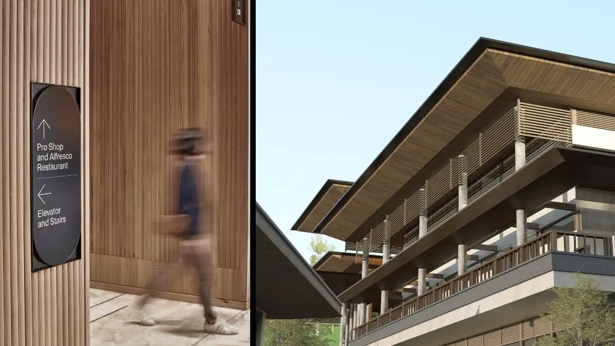
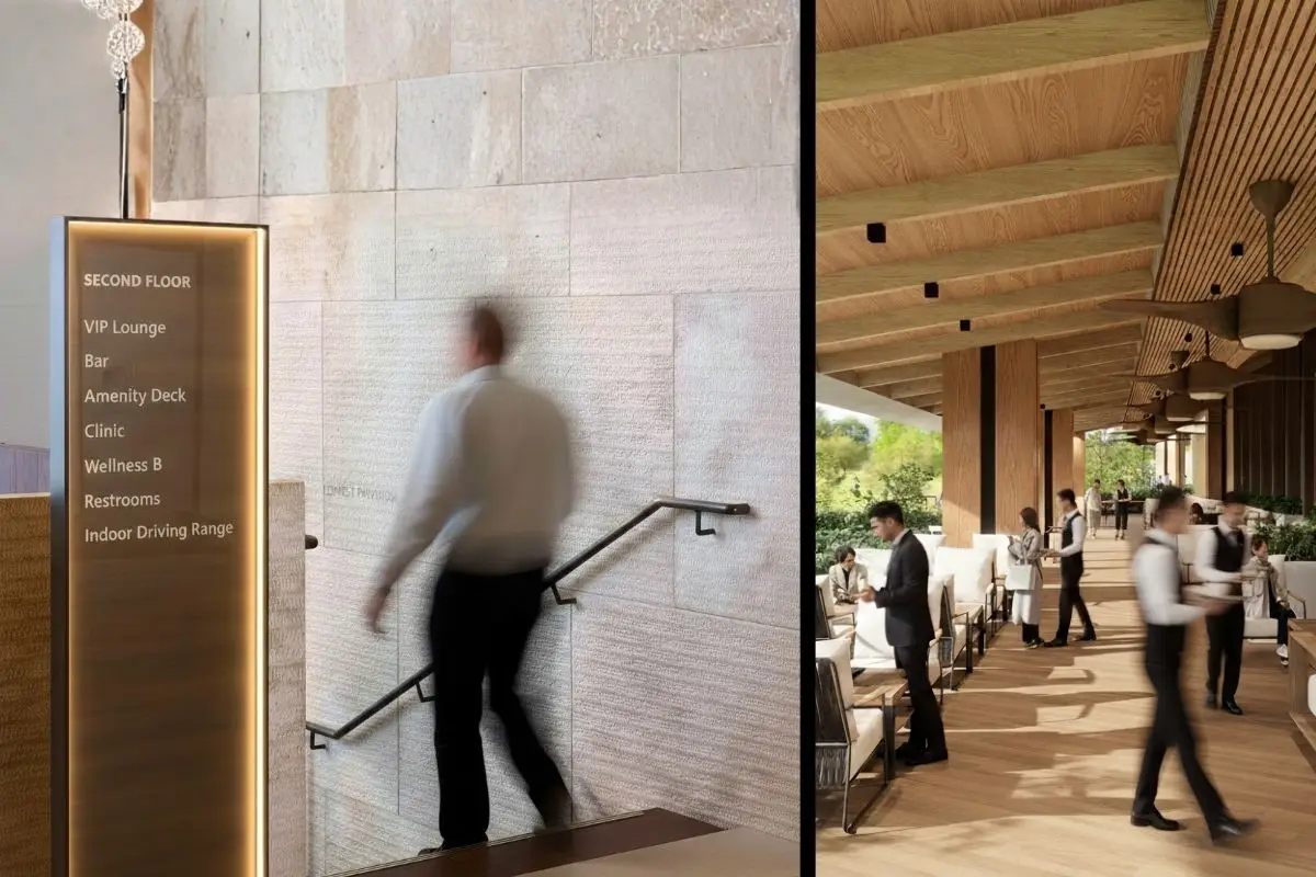
Successful wayfinding begins with spatial clarity before signage is introduced. Buildings that are easy to understand usually rely on visible circulation paths, identifiable entrances, intuitive transitions, and predictable spatial organization that allow users to move instinctively through a development.
Hospitals, airports, hotels, and commercial centers benefit significantly from this approach because visitors often navigate them under stress, unfamiliarity, or time pressure. In these environments, confusion quickly becomes an operational problem.
Good signage supports architecture rather than compensating for weak planning.
Projects that perform well over time often use architecture itself as a navigational tool. Natural light, material transitions, visual anchors, and controlled sightlines help people understand where they are without relying entirely on written instructions.
Common Problems in Philippine Developments
Many local developments struggle with wayfinding because projects evolve in phases without maintaining a unified circulation strategy. As tenants change, expansions are added, and traffic conditions shift, signage systems often become fragmented over time.
Some developments rely on oversized directional signs that dominate visual space without improving clarity. Others use inconsistent naming systems, poorly illuminated directories, conflicting arrows, or signage positioned without considering how people actually move through buildings and roads.
In mixed use environments, branding visibility sometimes overpowers navigational clarity. Commercial advertisements and tenant graphics compete directly with directional information, making it difficult for visitors to identify critical circulation guidance quickly.
Large township developments and lifestyle centers become especially vulnerable once they expand beyond their original planning assumptions. What may have worked during early phases often becomes insufficient once traffic volume, occupancy, and movement patterns increase.
Architecture and Signage Must Work Together
Wayfinding systems work best when integrated during the earliest stages of planning. Architects, planners, landscape designers, interior designers, and operations teams all influence how users understand movement through space.
Simple architectural decisions can significantly improve navigation. Aligning major circulation axes, preserving visual sightlines, organizing parking systems clearly, and creating identifiable transition spaces help users orient themselves naturally without depending on excessive signage.
When these decisions are ignored early, signage systems later become overloaded trying to correct problems the architecture created.
This becomes particularly important in Philippine developments where tropical weather conditions, mixed pedestrian behavior, traffic congestion, and high visitor turnover place additional pressure on circulation systems.
Accessibility and Human Behavior
Effective wayfinding should account for different types of users instead of assuming everyone experiences buildings similarly. Elderly users, first-time visitors, children, service personnel, delivery staff, and persons with disabilities all interact with buildings differently.
Signage systems that rely heavily on small text, excessive instructions, or inconsistent placement often fail under real conditions. Readable typography, clear iconography, proper lighting, predictable positioning, and accessible circulation improve navigation significantly without overwhelming users visually.
Good wayfinding reduces cognitive stress. People should spend less energy figuring out where to go and more energy using the space itself.
Why Good Navigation Improves Long-Term Value
Wayfinding affects more than convenience. It influences operations, tenant experience, maintenance efficiency, crowd management, and the overall perception of a development.
Buildings that remain easy to navigate generally require fewer corrective signs, less staff intervention, and fewer operational adjustments over time. Visitors experience less frustration, circulation flows more smoothly, and developments feel more organized overall.
The best wayfinding systems rarely call attention to themselves. They work quietly through architecture, proportion, visibility, hierarchy, and disciplined communication that allow people to move naturally through space.
Wayfinding often fails when signage is treated as an afterthought instead of being integrated into architectural planning, circulation design, and operational strategy from the beginning.
Effective signage is clear, consistent, readable, properly placed, and coordinated with the building’s circulation system and spatial hierarchy.
Excessive signage creates visual clutter and makes important information harder to identify quickly, especially in busy commercial environments.
Architecture improves wayfinding by creating intuitive circulation paths, visible landmarks, strong spatial organization, and clear transitions between spaces.
Clear navigation systems shape how people experience buildings long before they notice architecture itself. At Fulgar Architects, we approach wayfinding as part of a larger planning strategy that connects circulation, usability, operational clarity, and long-term adaptability. Explore our architectural and master planning services or connect with our team to discuss developments designed for intuitive movement, efficient operations, and better user experience.